Overview
Problem statement
The operations team wants faster client visits and is often scared of filling information wrong
Either by being rushed in with too many establishments visits scheduled for the day or not having much time to finish a survey, the operations team feel anxious performing their work. A sense of having too much information to fill in and wanting to have the quickest visit possible can be overwhelming.
Proposed solutions
Feature #1
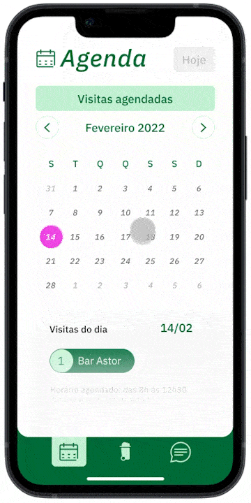
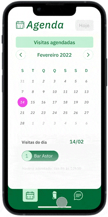
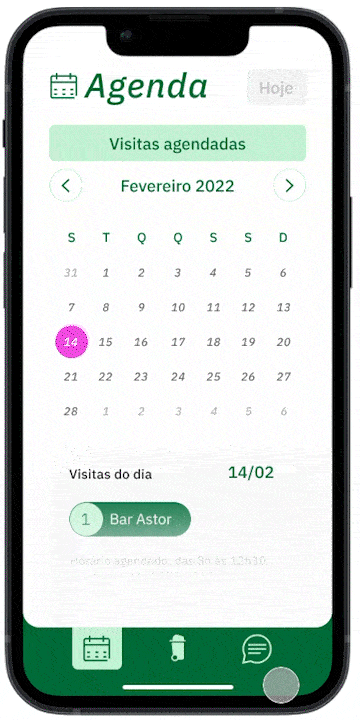
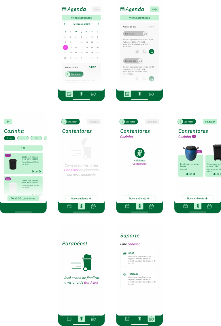
Easily visualize your scheduled visits for the day and get directions from your favorite app
Feature #2
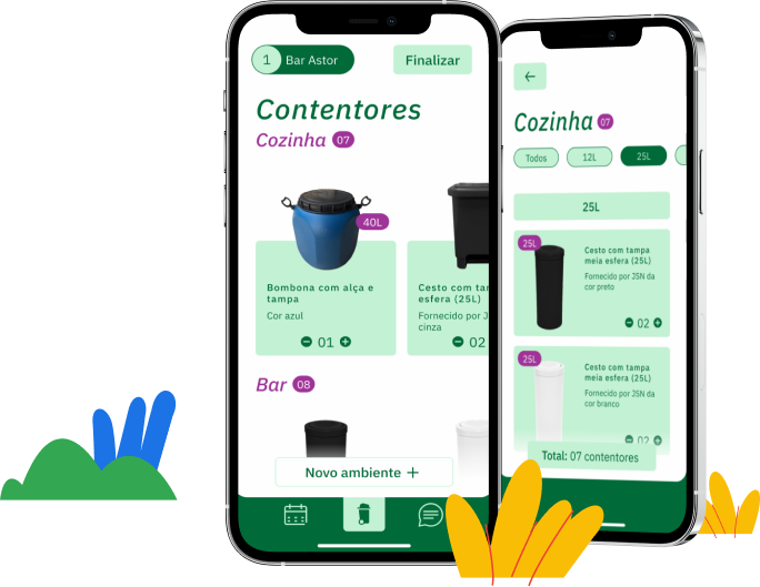
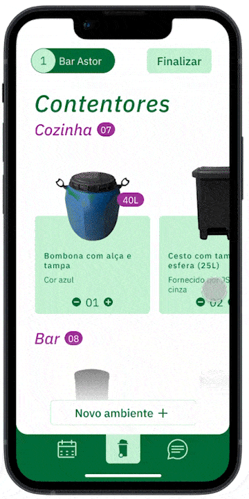
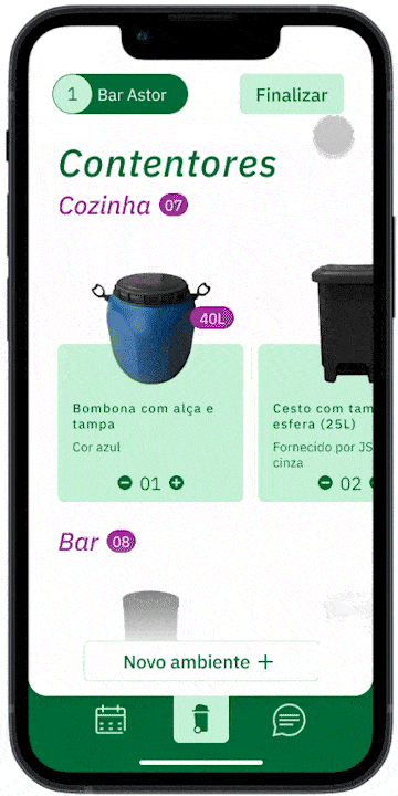
Quickly add each establishments’ room and their current waste solution
Feature #3
Revise and iterate instinctively during and after the visit
Feature #4
Interactions to help guide the user through the app
Feature #5
Ask for live support with only two clicks
Ok, those are the problems and solutions
... but how did we get here?
Understand
Stakeholders and company goals
Create a platform to replace endless spreadsheets

Musa was aiming to optimize their survey process.
There was a clear setback in standardization and speed that forms and spreadsheets were lacking and anxiety from the operations team who fill them out.
Our challenge
Consolidate the mapping process for each client’s room and waste solutions through an app.
Having as a reference the company user interface available in their current website and its branding.
Behavior research
Learning from the operations team
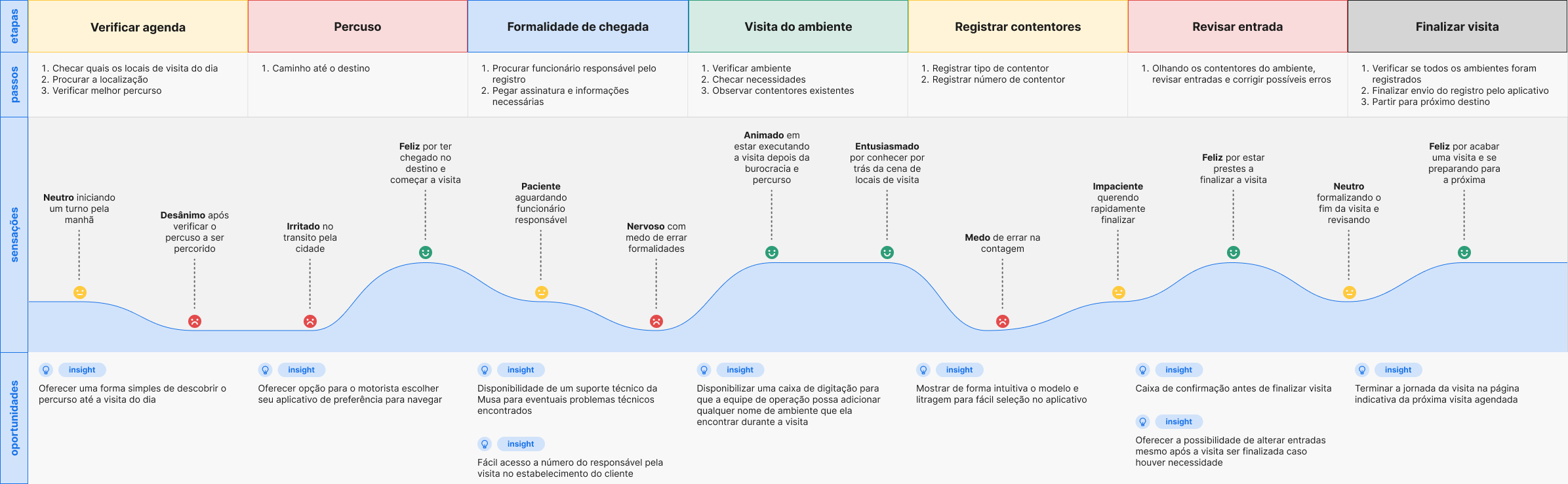
To learn about how the operations team both feel and perform during a survey visit, I looked for insights by observing them in loco, as well as mapping their journey throughout their day.
Insight #1
Observe the operations team in-person
Although ideally usability is based on observation of users in the field at an initial moment, given the situation of the case study, we opted for the use of benchmarks and remote usability tests.
Insight #2
Journey mapping to better identify user needs
Despite considering the input from the operations team essential to support the application, given the situation, remote interviews with 5 users from 25 to 50 years old took place.
In-person study
Learning from the users
Over +16 hours of accompanying survey routines
After gathering quantitative results, I found important to get some qualitative ones. That's when I went after observing their daily routines.
Insight from in-person study
Time management is the main pain point for users
Either by having uninterested peers or not having much time in town, youngsters tend to feel anxious while visiting the gallery.
A sense of possibly wasting their precious vacation time and wanting to have the best possible experience can be overwhelming.
User journey maps
Discover the tools used for this part of the process
After that, user journey maps where created in order to help identify obstacle-free paths for users, highlight pain points, and identify improvement opportunities.
Define
Problem statements and hypothesis statements
User needs and propositions
In this phase, defining unspoken user's pain points and using them to form strong problem statements was a main objective, followed by hypothesis on how to design solutions to those problems.
Value proposition
From findings to features
Having in mind the previously developed research, problem statements and hypothesis statements, a list of all features and benefits came up with for my product was created. Then I moved on to answering questions such as "what does my product do?" and "why should the user care"
With these answers I was able to identify unique value propositions and filter out the ones that were not actually beneficial to the users.
Sketch
User flow
Competition strengths and weaknesses
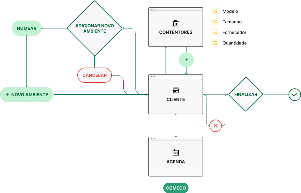
In sequence, to anticipate user needs when interacting with your product, user flows were created clearing and simplifying an outline for their app experience.
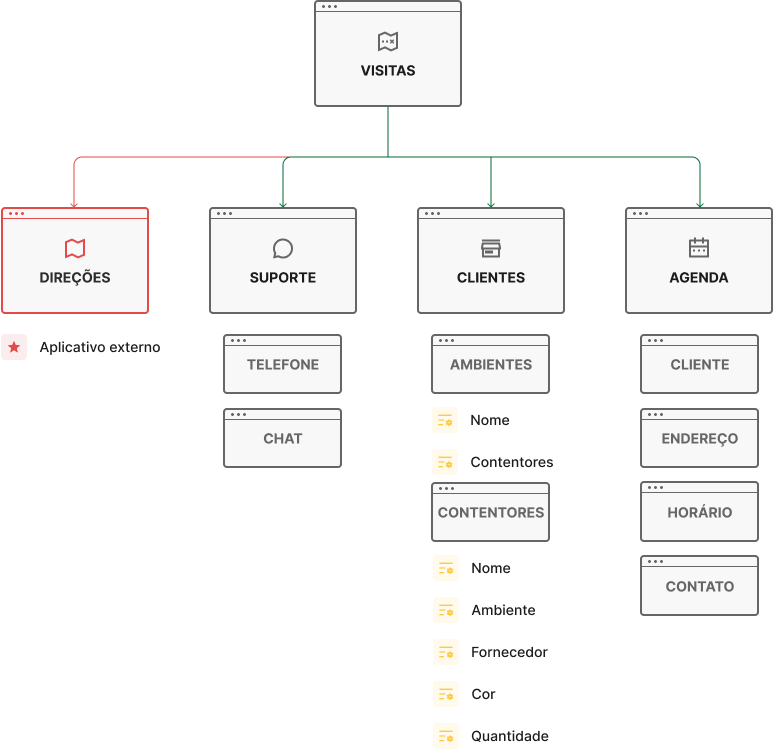
Information architecture
Organization, hierarchy, and sequence
The IA chart used in order to organize and sort the information that the design presents, so users can successfully experience and interact with the app.
Prototype
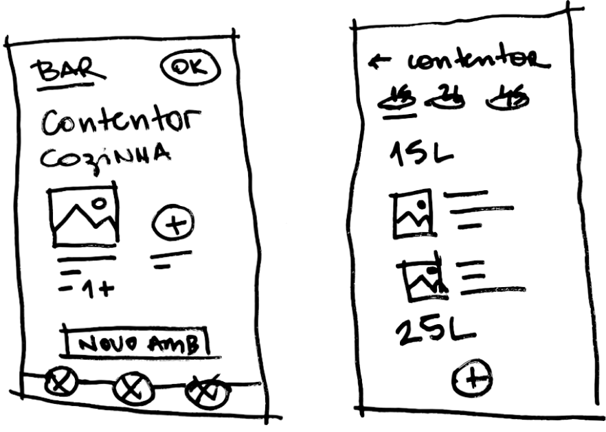
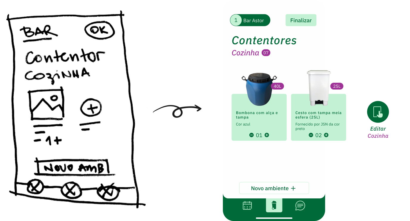
Low-fidelity wireframes
From paper to the screen
Crazy Eights was the exploration method used to try and think outside the box and you have to come up with many ideas in a short time frame, without judging them. This meant to quickly develop many options for each frame and being able to nitpick qualities from different propositions.
Styleguide
Extracting from the exiting styleguide
To learn about the lucky individuals tasked with building the culture of their workplace I sent a survey to a targeted set of contacts that were in HR roles. I then took the responses through a card sorting exercise to find common themes amongst the respondents.
High-fidelity wireframes
From paper to the screen
After the UI team updated the mid-fidelity prototype I animated the prototype so that it was a closer reflection of how our users would be interacting with the app.
Validate
Does it actually work?
User testing
I conducted five user testing sessions from the user's perspective as well as frame testing to ensure that the information architecture of the overall app made sense.
Some changes were then made to ensure the best usability for the users.
A/B testing
Refined item selection
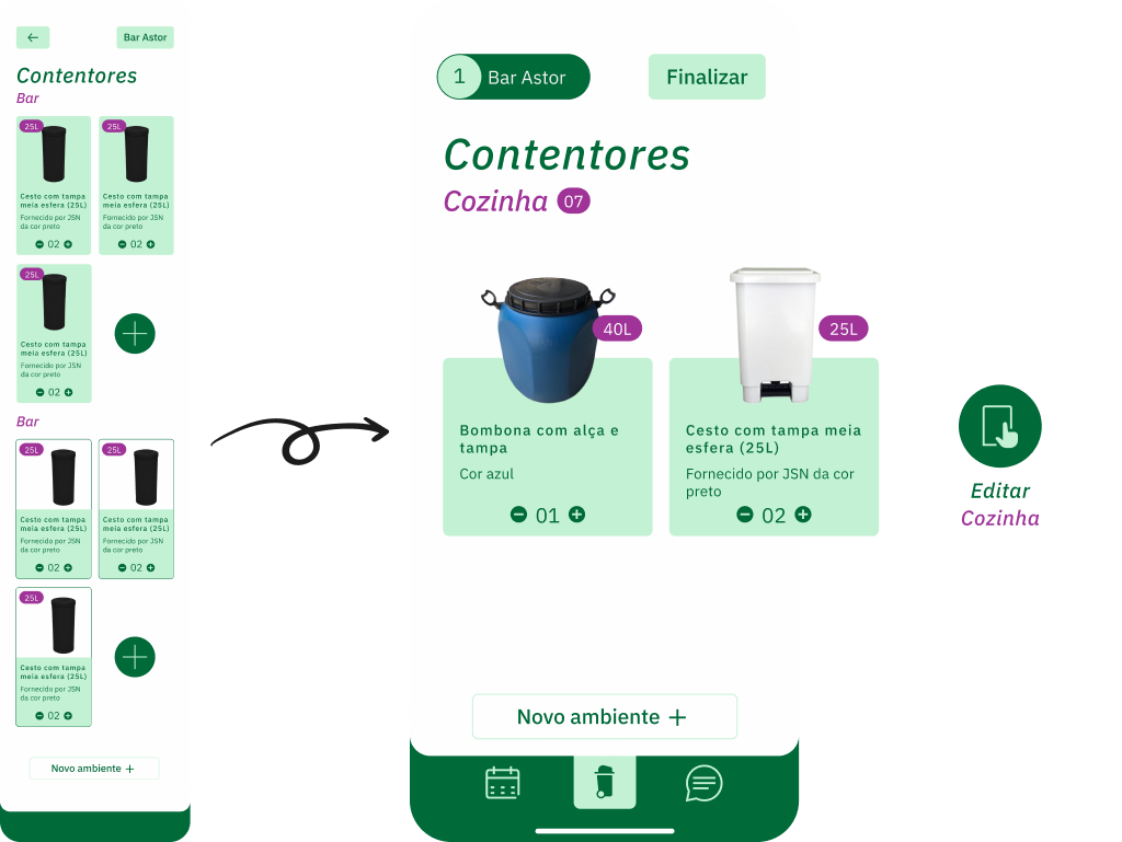
Screens with different methods to add containers and environments were tested.
The solution adopted was seen as more intuitive, making it easier to locate containers within environments.
Change #2
better distributed interactions
Users had trouble engaging with some features such as liking artwork guides and being able to remove artwork from their queue.
Final thoughts and frames
And that's a wrap!
In the end, I was extremely proud of the final product I'd created (30+ screens) and how far we'd come in just three weeks.
Other projects you may like
While you're here why not enjoy yourself
The National Gallery
This project was made as part of the course 2 of Grow's by Google Certificate Course on UX Design.
Explore case studyInvent
Here you can have a peak on what I've worked on during my time as an UX Designer at Invent.
Request access